A logarithmic scale is very useful when you need to plot data over an extremely wide range. However, sometimes even a logarithmic scale may not reduce the visual range enough.
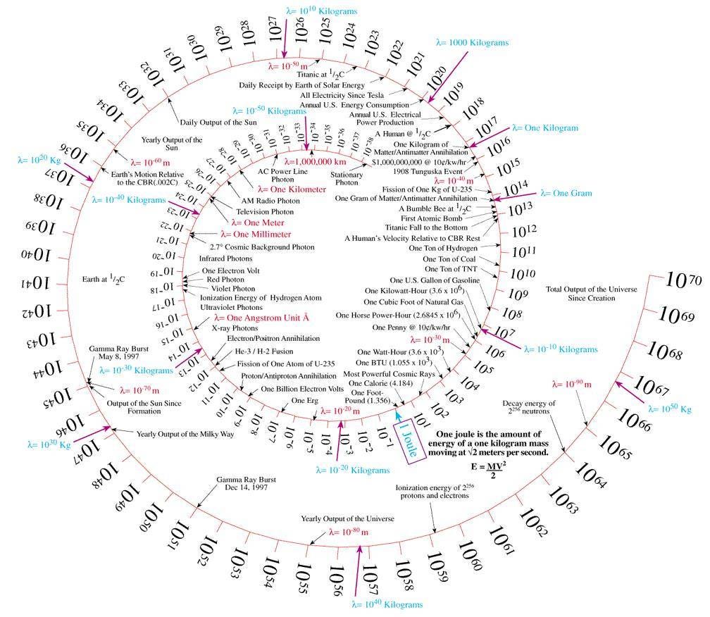
I [Cook] recently saw a timeline-like graph that was coiled into a spiral, packing more information into a limited visual window:
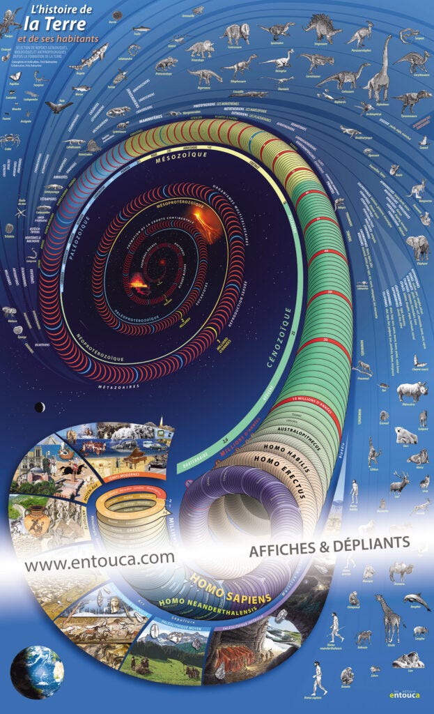
That's fine, but I can do him one better. It's this amazing visualization of "L'histoire de la Terre et de ses habitants," which goes all the way back to the beginning, 4.5 billion years ago, while still, amazingly, containing details all the way through the twentieth century!
Thanks for reading The Future of Statistical Modeling! Subscribe for free to receive new posts and support my work.
How did they do it? Through a series of tricks:
1. To start, they used the spiral pattern that Cook discussed to more efficiently use the space in two dimensions.
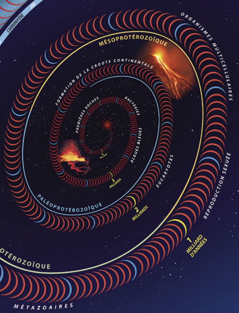
2. They also used an expanding scale so that the spiral is smaller on the inside and then gets bigger as it expands:
Pretty cool, huh? Each yellow band is a billion years, each blue band is 100 million years, each red band is 10 million years. When you get to the most recent billion years, you see some space between the red bands.
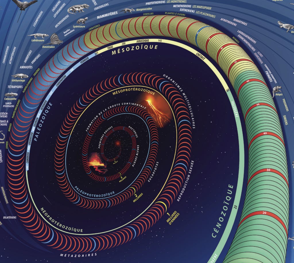
3. As the spiral expands further, there's more and more space between the red bands, and they include intermediate bands---first light blue, then yellow, then green---corresponding to each million years:
I think it would be cleaner to use a single color scheme here, but they make the choice to vary the color to indicate the different geological periods.
4. As the spiral gets even bigger, something really cool happens: the rings become ropelike tubes that themselves have a helical structure:
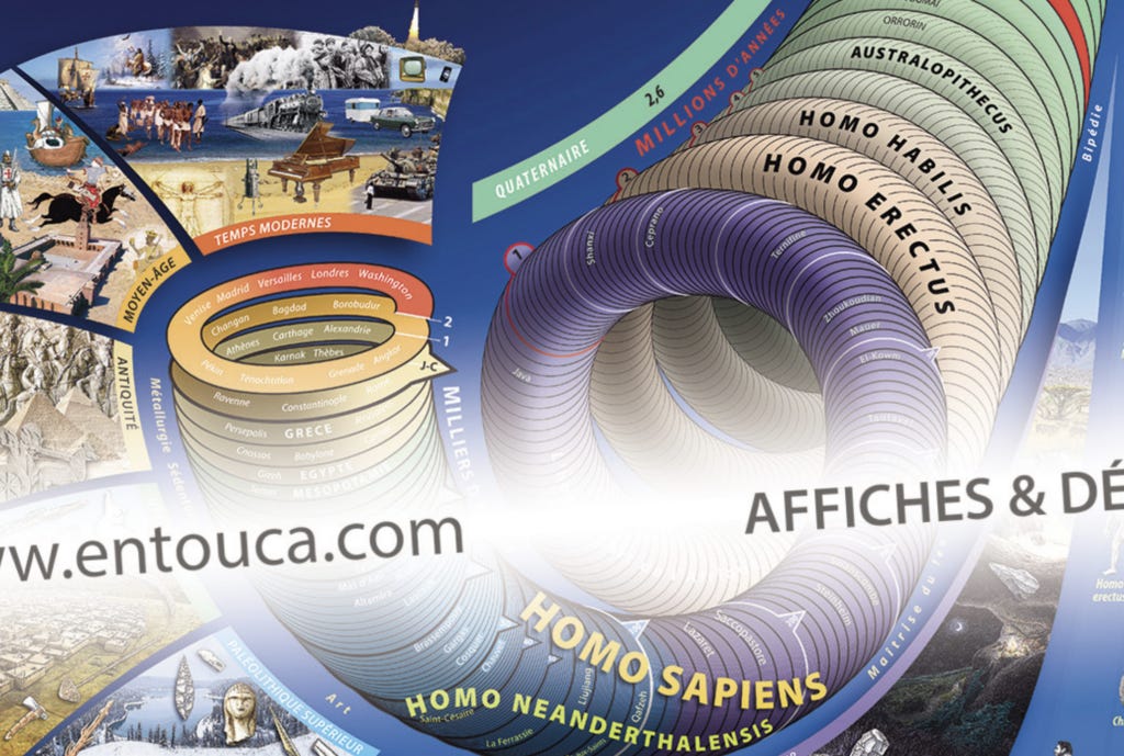
Each twist in the larger spiral corresponds to a "band" or ring of a million years, and now each such ring is itself a spiral with 100 twists or bands, each corresponding to 10,000 years. Once we get to the most recent million years, we can see the twists themselves are in batches of 10, with white bands at each 100,000.
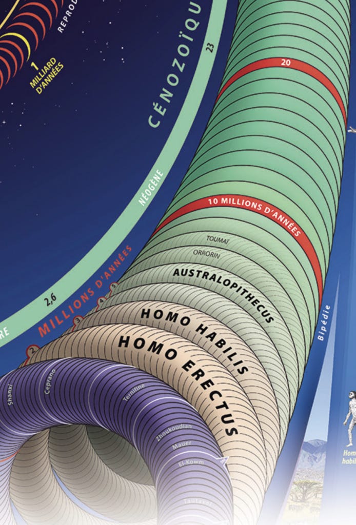
5. The big spiral has been revealed to have been a rope all along, and that rope is itself a spiral with rings at every 10,000 years. The scale continues to expand as the inner spiral spools out, so that starting around the past 50,000 years, another layer of rings becomes visible, showing each 1000 years:
6. In the most recent few thousand years, we can make out details within each millennium---there's room for about 10 labels within each ring, thus labeling each hundred years or so.
Really cool! It's the Powers of Ten of static graphics.
Here's the whole thing in one image:
I recommend you buy one for your own wall. It only costs 15 euros!
Thanks for reading The Future of Statistical Modeling! Subscribe for free to receive new posts and support my work.